I’ve been using and consulting about Cognos since its begging starting from the impromptu, until today’s 11. I wanted to share my thoughts about what I think may be important to consider in the next releases, based on my clients’ feedback and my personal experience as business trainer, consultant, and presales.
Just to make it clear, the objective of this article is simply a personal feedback, I will try to point out what is in my opinion simple stuff that can really make a difference, I’ll focus essentially on the visual aspect, and I’m preparing another article about Cognos Analytics Under the Hood, Planning Analytic visual Aspect and Planning Analytics Under the Hood.
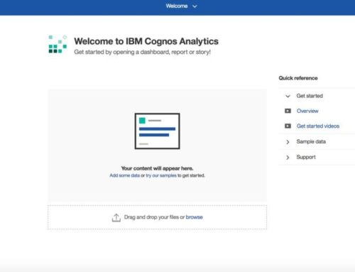
The welcome page:
Big thanks to this much-wanted upgrade to the interface that didn’t get any visual upgrade since the Report Net version in 2003. And now the R7 home page with the ability of inserting file with a simple drag an drop is perfect. And the home button at the top left is a life saver.
Now that we have this, it’s smooth, and much more user friendly than before, still there is a lot of improvements to do.
The header bar is very interesting, because now, and finally, we can manager everything inside only one window or one tab, in Cognos 10 it was a nightmare, but, it’s not that intuitive to guess that you can move from one report to another, may be adding between brackets the number of opened window like that.

The search area is great, another nice to have is to customize the modification time with something like that
- All
- Today
- Yesterday
- Past week
- Past month
- Custom (Between Today and 31/11/2016) for example.
The “Recent” part is fantastic, it would be a nice to have the same filter feature that is provided in the other tabs it would look like that

Importing data
We can import CSV, Text or XLS/XLSX, the system recognizes easily the coma and tab separator for CSV and text, but it’s impossible to import a specific tab from an excel file. and its also impossible to import SPSS files, it should recognize the SPSS files
Dashboarding
When you create a dashboard, out of the box you have too little customization options in my opinion:

- No way to change any fonts, only text boxes
- The color selection is very poor and limited
How hard is it to put that color selection instead and leave it to the user ?

The dashboard theme, you must choose only between 3 of them (Default, light and dark), and I looked up everywhere there is no way to create your own theme, I may be mistaken, if you know a way to do it, please feel free to add it on the comments.
The shape part is also, little messy, I think they should be organized by groups or subjects, also I think that some of them are useless, I sincerely don’t think that a business user would consider inserting a dead skull in his report, especially this one :

I believe, that since, we can insert images in the media section, the images the whole shapes part is useless. The R7 have the ability to play with a customized image library. the SVG files are good idea, they render perfectly, but the user (or administrator) should have the ability the add its own SVG icons in this section.
Talking about the image, you cannot use a relative path like you would do in report, I think that its best to have an inserting image window like we have in report, remember the go live import/export is painful when you have absolute path

Speaking of what, the Browse button don’t work, out of the box in report with the easy installation, that’s not cool

Back on dashboard:
You cannot copy/past a widget from a tab to another, it’s very helpful because, you can’t make your design tab bigger, once you chose a layout, it’s over, that’s why sometimes you want to move widget from one tab to another
Now the dates:
100% of data reports rely on dates, and a lot of business users put a day date granularity in their reports and some of them monthly data. In both case, Dashbord should identify a date based column and propose a navigation path on years, semester, quarter; months and dates, like in the data module, or better like the time dimension on Transformer which is by far the best auto generated dimension Time I’ve ever seen with all the calculated variance etc…. We can even imagine that we can define the current date in dashboard for calculating a YTD, that would be perfect.
To make it simple, you cannot create a dashboard with dates out of the box, you must calculate, the years, quarters etc… in excel first or do it manually in data module.
The widgets :
Big issue here, I have the feeling that IBM is trying to use it’s own font everywhere in the portal HelvNeueforIBM but it render very bad and it’s pixelated, the overall impression that I have is pixelated (menu, model, text, properties,etc…) , look at these examples

If I hack a little bit the IBM source code I would have this, just using a classic font family (Helvetica,Arial,sans-serif)

See the difference ?

It may seem like nothing but, if you look closer, in my opinion, it’s a game changer on the look and feel of a dashboard
We are talking about visualization, so out of the box, visually it must be perfect!
Report :
Let’s keep talking about visualization:
Now we have this

- New visualization
- Legacy visualization
- Charts
Let’s compare a pie for example
Out of the box, we get this :

The first one has a default huge font on legend, that makes the pie itself too small, and the number inside are too big. and you cannot customize your own palette.
The second is still better than the first, with a bigger pie, the legend is not auto sized so unreadable and, unfortunately, you still can’t customize you own palette.
In the third still have the best customization option, you can add notes, customize palette, show values with different type (absolute, percentage). with a simple right click. And last not least, it’s the only one that is still compatible with Ms Excel. The legacy and the new visualization are converted into a static image on Excel.
I don’t want to be nostalgic but for me the old charts are by far the best option to use to get something decent and visually beautiful, and totally customizable out of the box.
My question is, why visually it’s not getting better, and what will happen to the great old charts? should we stop use them? RAVE 2 is supposed to be a better option, but if we compare the RAVE 2 and the old charts, we still have a huge gap visually and technically. I’m talking about customization and the visual impact out of the box.
Personally, after more than a year of training and change management for the Cognos 11, 90 % of the trainee did not notice the little filter on the top right of the window, and all of them were disappointed to discover that the solution provides only 27 visualization options

They did not know that the best 179 charts are just two click away.
In my opinion, the visualization Gallery widow must be revisited, the solution should show what it has best first until may be the RAVE 2 charts are more stable, more customisation options, and must of all be compatible with excel, and provides some more options, not only 27.
And for all of them, we still cannot put the size and overflow of the object in percentage, we must use a fixed size, not very helpful when you do some active reports.
Conclusion
The IBM Cognos Analytics a big step forward comparing to the old C10, but still some improvement to make visually to have a perfect product specially charts and default palette colors on Dashboard.
IBM must have its visual identity with C11, for me, Cognos analytics is still the best BI product on the market (under the hood we have the best analytic tool, the best modelling products, the best OLAP/ROLAP/HOLAP and in memory process… etc…) so the visual identity must be also the best on the market.
